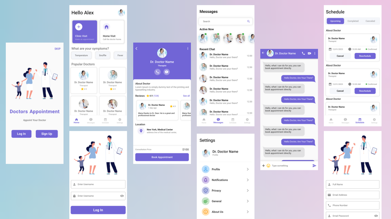
Medical Healthcare App UI Design in Flutter – Source Code
The healthcare industry is undergoing a digital revolution, with mobile apps playing a central role in improving patient experience and care delivery. A well-designed medical healthcare app UI (user interface) is crucial for this transformation. Flutter, a popular cross-platform framework by Google, offers exceptional capabilities to craft user-friendly and visually appealing healthcare apps.
This article delves into the world of medical healthcare app UI design using Flutter. We’ll explore the advantages of Flutter for this domain, delve into key UI design considerations, and uncover best practices to ensure your app fosters a positive user experience.
Why Flutter Shines for Medical Healthcare App UI Design
Flutter presents a compelling set of advantages for building medical healthcare app UIs:
- Cross-Platform Development: Flutter enables you to create a single codebase that seamlessly functions on both iOS and Android devices. This translates into significant cost and time savings compared to developing separate native apps for each platform.
- Rich UI and Animations: Flutter boasts a powerful rendering engine that empowers you to design stunning UIs with smooth animations. This is particularly valuable for creating intuitive and engaging experiences for users navigating healthcare information or interacting with app features.
- Customizability and Performance: Flutter offers extensive customization options, allowing you to tailor the UI to your specific app’s needs and brand identity. Additionally, Flutter apps are known for their exceptional performance and responsiveness, crucial factors for ensuring a smooth user experience, especially when dealing with sensitive healthcare data.
- Open-Source and Growing Community: As an open-source framework, Flutter enjoys a vibrant and supportive community. This means you have access to a wealth of resources, tutorials, and pre-built widgets specifically designed for healthcare app development.
Key UI Design Considerations for Medical Healthcare Apps
While crafting a medical healthcare app UI, prioritize these key aspects:
- Clarity and Simplicity: Healthcare information can be complex. Strive for clear and concise UI elements. Use intuitive layouts, easy-to-read fonts, and uncluttered screens to ensure users can effortlessly navigate and understand the app’s functionalities.
- Accessibility: Make your app inclusive for users with disabilities. Follow accessibility guidelines to ensure proper color contrast, text magnification options, and voice control compatibility.
- Data Security and Privacy: Security and privacy are paramount in healthcare. Implement robust security measures to safeguard sensitive user data. Clearly communicate your data handling practices within the app to build user trust.
- User-Friendly Navigation: Design a seamless and intuitive navigation system. Utilize clear and consistent navigation bars, menus, and icons to allow users to effortlessly find the information and features they need.
- Building Trust: Healthcare is a sensitive domain. Foster trust by incorporating elements that convey professionalism and reliability. Utilize high-quality visuals, clear calls to action, and informative tooltips to guide users.
Best Practices for a Stellar Medical App UI with Flutter
Here are some best practices to consider when designing your medical healthcare app UI with Flutter:
- Leverage Pre-built Widgets: Flutter offers a rich collection of pre-built widgets specifically designed for creating user interfaces. Utilize these widgets to streamline development and ensure a consistent user experience across platforms.
- Prioritize Readability: Employ high-contrast colors and easy-to-read fonts. Make crucial information stand out through clear hierarchy and visual cues.
- Incorporate White Space Effectively: Don’t overload screens with information. Utilize white space strategically to enhance readability and create a sense of calm.
- Emphasize User Input: Implement intuitive input fields and forms to empower users to interact with the app effectively. Utilize clear labels and validation to prevent errors and make data entry seamless.
- Incorporate Visual Appeal: While prioritizing usability, don’t neglect aesthetics. Utilize calming colors, subtle gradients, and relevant icons to create a visually pleasing and professional UI.
- Test Rigorously: Conduct thorough testing across various devices and screen sizes. Ensure the UI remains consistent and functional throughout the app experience.
By following these guidelines and leveraging the power of Flutter, you can design a medical healthcare app UI that empowers users to manage their well-being effectively. Remember, a well-designed UI not only enhances user experience but also fosters trust and engagement within the medical app ecosystem.
Watch Video On YouTube: Medical Healthcare App UI Design in Flutter
Complete Source Code: https://bit.ly/3UydlRp
Assets: https://drive.google.com/drive/folders/1sMEFEGobWTD9bbHDjDJdVwFwByYUqHiY?usp=sharing


